Wednesday, January 13, 2010
New Blog
Wednesday, December 2, 2009
5 Favorite Pics from Project


Rocky Seniors Display
However, I did some research on the exhibit and was able to view a couple pictures that were displayed.
I was able to find out that there were three seniors whose art was included in this particular exhibit. Those three are Cassie Scheidecker, Krista Hoyes, and Monica Geary.
I found an article (after googling the exhibit) about the exhibit that had a photo attached by Cassie Scheidecker. The photo was of a person, presumably her, who was playing the guitar, but her arms and hands were surrounded by barb-wire. This photo was intended to represent the struggles Scheidecker has with a severe case of arthritis and how it complicates the things she loves to do. I found this particular composition inspiring, touching, and very emotional. It was an amazing photograph.
Wednesday, November 18, 2009
doesn't get more real than this. :)

Nie Nie Dialogues:
There is a blog that I like to read frequently.
It's by a woman named Stephanie Nielson.
She was in a airplane crash a while ago,
and suffered severe burns on most of her body.
She is an avid blogger and uses creative
photography to show the essence of her life
at home with her kids and husband.
She doesn't do photography professionally,
I believe, but her work is so amazing, down
to earth, and real. I admire it with
gusto. It really shows life in it's purest form
and I really relate to it.
And she uses a canon rebel xsi. *smile*
Plus! Her whole life style is based around
vintage everything, which is totally
awesome...
http://nieniedialogues.blogspot.com/

Monday, November 16, 2009
Photography Assignment


A SILHOUTTE AS A MAIN POINT OF INTEREST

USE OF LENS HYPERFOCAL SETTINGS
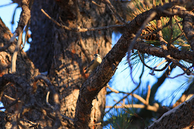
USE OF PANNING/BLURRED MOTION
I used a panning motion while trying to capture this bird at Rim Country. However, in the process, the settings on my camera were not accurately placed and I could have not had my camera completely steady, plus the movement from the bird gave a little blur to the picture. This was also taken using Dave's 70-200mm.
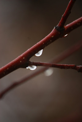
DETAILED CLOSE UP
This was taken on Rocky's campus of a tree branch attached to a tree. I used my 50-250mm to take this shot and put the f-stop down to a 4 to create a highly blurry background and a small focus point.
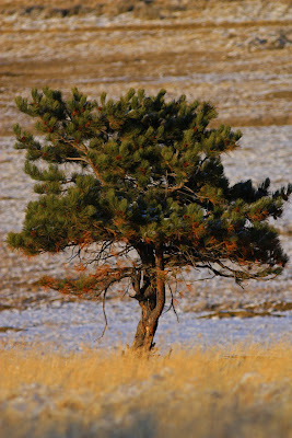
CLEAR USE OF THE "RULE OF THIRDS"
This tree was shot in a prairie dog town in Rim Country. It was a lone tree in the plain of the town and I thought it somewhat interesting. I tried using the Rule of Thirds to evening split the landscape and create a photograph under this particular rule.
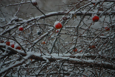
YOUR PICK
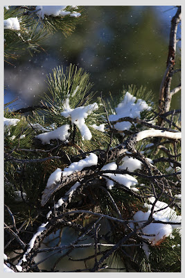
I like this photograph because it gives a clear, focued look of the branch and the snow placed on top of it, but you also get some snow falling in the background which I think looks pretty cool. :)
Monday, November 9, 2009
Randy Smith
So I was on a search for commercial photographers again.
I typed in "commercial photography" and this guy caught my eye.
His name's Randy Smith and he does a wide variety of commercial photography.
Some of his genres include aviation, travel, vehicle, and product photography.
I found his work inventive and interesting.
The whole commercial photography field gets more and more appealing.
check it out.


